Potloc tips for understanding and exploiting your data
Potloc tips for understanding and exploiting your data
Index
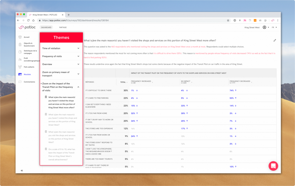
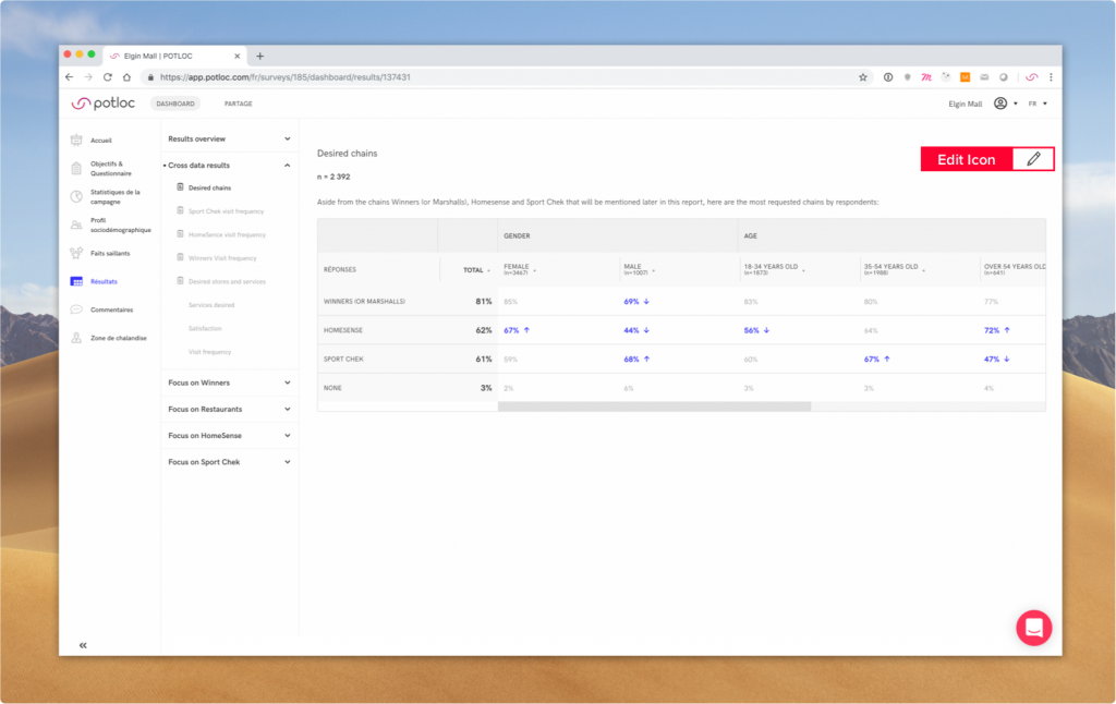
Our data analysts select the most relevant data and organize results so you can read through the story more easily. Here’s what you need to know:
- Results are organized by themes (usually your study objectives)
- Each theme contains different questions
- Results for each question are filtered and displayed in tables
- You can choose how results are displayed (order, graph type, cross-data filters)
How to read tables
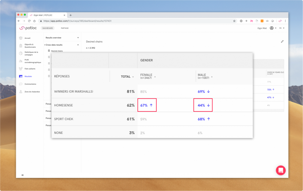
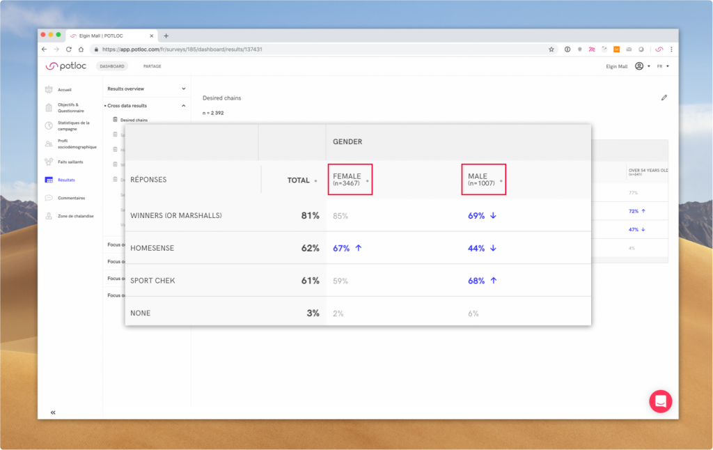
Interpret numbers
A stat should be read like this: “x% of [column] has answered [row]”
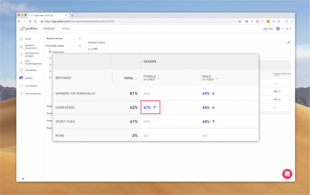
Identify significant results
Results that are highlighted in blue are the most significant results. The calculation is based on the chi-square test and the arrow indicates if the result is higher or lower than average.
Make sure results are valid
We usually consider a result to be valid when there are at least 30 respondents, meaning n > 30 for the subgroup.
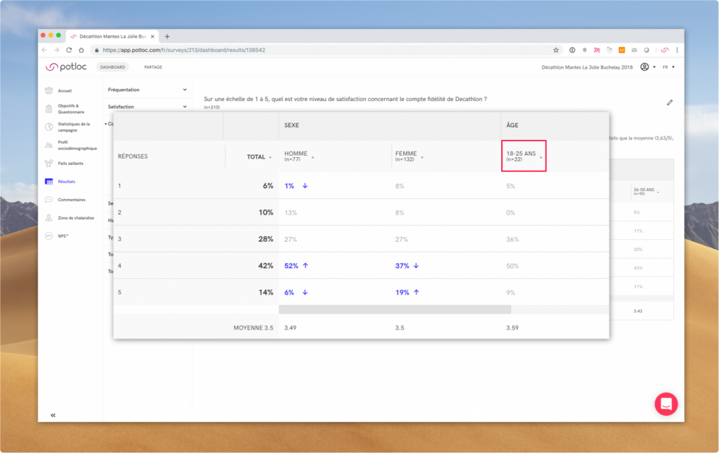 Here results for the category “18-25 years old” sub-group are not valid (n=22)
How to mine your data
Our team has pre-selected the most relevant cross-data filters and displays. You can always change the settings yourself to activate and deactivate cross-data filters, arrange order, or display data with a different graph type. Note that your changes won’t be saved in the app.
Order the results
Simply click on the icon next to the column title to reorder the results.
- The order will cycle between ascending, descending, and logical
- In some cases (“I don’t want to answer”, “Other”) an answer is locked and will always stay at the end of the list
 Here results are ordered by descending results within the “Female” group
Go to edit mode
To access all options, you need to turn on edit mode by clicking on the edit icon next to the question title. Simply click on X to return to browsing mode.
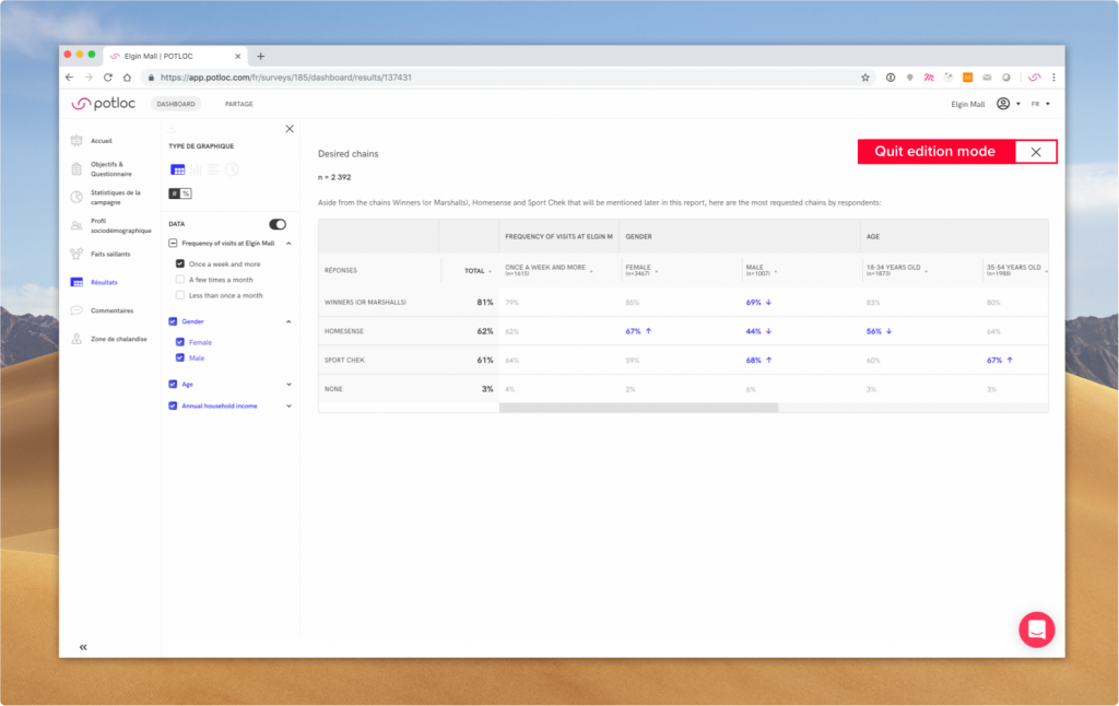
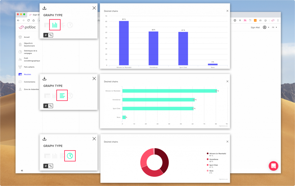
Change graph type
- Click on graph type icons and see which one is the most appropriate
- When choosing a graph type other than a table, results will automatically be displayed as primary results
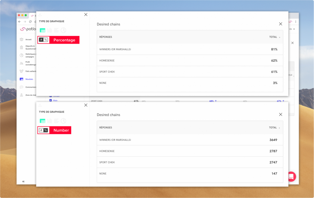
Change count type
You can choose to display results as percentage or a number.
Change cross-data filters
You can choose to activate or deactivate cross-data filters as a group or select a specific sub-category. Filters highlighted in blue indicate that these groups contain significant results.
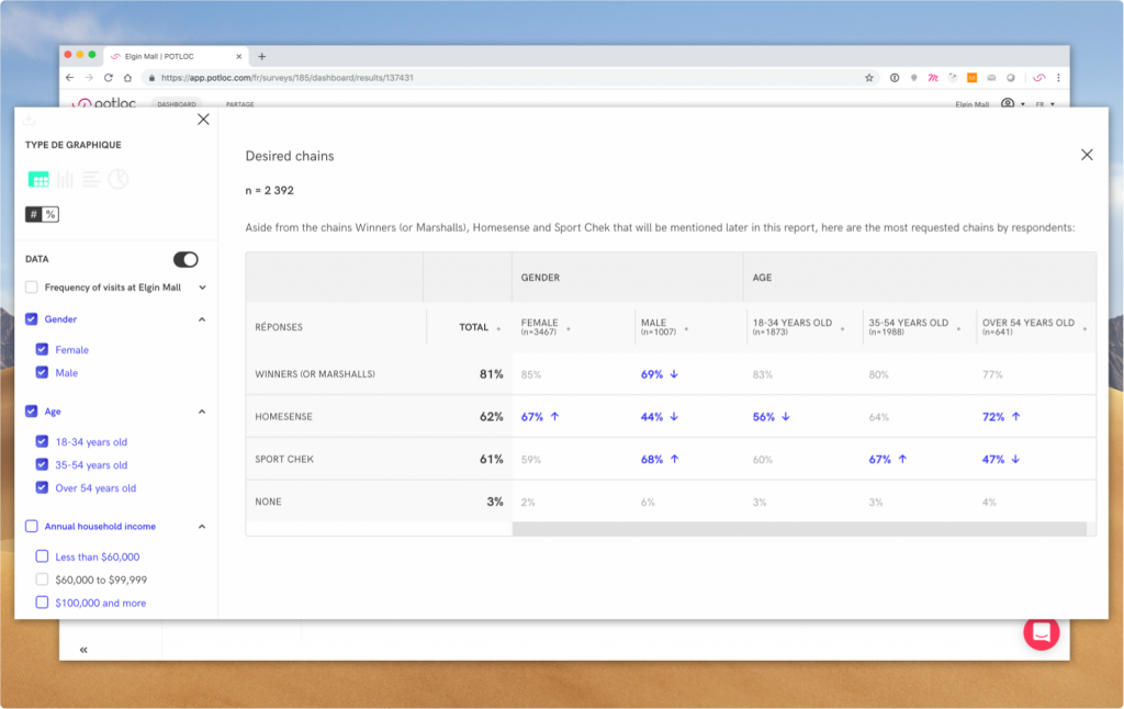 Here, “Gender” “Age” and “Income” show significant results whereas results don’t depend on type of “Frequency”
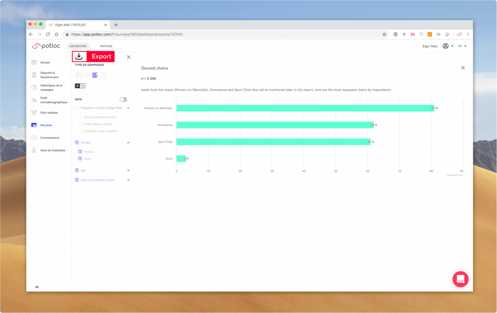
How to export results
To export a graph, simply click on the export icon in the edition sidebar.
The app enables you to export any primary graph. We’re working on giving you the ability to export data in Excel format.