Overview
Quality Transparency gives you a complete, transparent, and research-backed view of the quality of your sample.
It’s the first feature on the market that not only filters out low-quality data — but also helps you understand what good quality looks like, and which sources are delivering it.
On this page, customers can:
- Get an overview of the quality of their survey
- Understand where their respondents come from and evaluate the quality of each source.
- See how your data is cleaned - pre, in and post survey
- Explore the quality controls used by Potloc
With this report, you'll understand your sample composition, be able to dig into our cleaning methodology in detail, and evaluate how Potloc ensures data integrity at every stage of the process.
Potloc’s Quality Transparency feature opens the black box, giving you a clear, visual breakdown of where your respondents come from and how each source performs — so you can trust the data you use to make decisions.
Navigating the report
The report is divided into four key sections:
- Quality overview
- Quality per source
- Quality cleaning performance
- Quality per control
Quality overview
Once a project hits 50% collection, this section provides a snapshot of the core survey metrics, helping you understand how respondents were cleaned throughout the survey to reach your final sample. Key figures include:
- Survey Attempts: Total number of people who tried to take the survey.
- Partial Respondents: Participants who did not complete the survey.
- Qualification Terminations: Respondents who did not meet the qualifying criteria.
- Quality Terminations: Respondents removed due to low-quality responses or behavior.
- Overquota Respondents: Extra respondents or those collected beyond the contractual quota.
- Sample Respondents: The respondents that make up your final, cleaned sample.

Quality per source
This section provides a detailed view of how each source contributed to your final sample and how it performed on quality. Each row in the table represents a source and provides three types of information about the quality of a source:
- Sample share
- Good-to-bad quality ratio
- Survey attempts
We recommend reading this table in the following order:
- Start with the Sample Share - Understand how much each source contributed to your final cleaned sample, helping you gauge how much each source influenced your data.
- Review Cleaning Metrics - See how many respondents from each source were filtered out during our cleaning process.
- Check the Good-to-Bad Quality Ratio - This relative indicator will compare the number of respondents who passed our quality checks to those who failed. A higher ratio means a better inherent quality.
- Look at Survey Attempts - This shows the median number of survey attempts (not completes) in the last 24 hours for that source's respondents. A higher frequency will signal professional survey takers while a low number would suggest more natural and genuine respondents.
A 🏆 trophy icon will appear next to the source with the highest sample share, the best good-to-bad quality ratio and the lowest survey frequency.

Quality Cleaning Performance
This part of the report outlines data cleaning performance across the three stages, showcasing how quality is upheld at every level:
- Pre-Survey Validation: Prevents bots, fraudsters, and duplicate respondents from entering your survey.
- In-Survey Validation: Removes ineligible and dishonest participants, while flagging potential low quality respondents.
- Post-Survey Validation: Checks the accuracy of open-ends and confirms bad quality respondents.

Quality per control
This section details all of the quality checks applied at each stage of the cleaning process. It’s the best place to see each check's impact and how it contributes to refining your final dataset.
At Potloc, we employ 15 data quality checks across our data cleaning process to detect, filter and terminate bad quality respondents.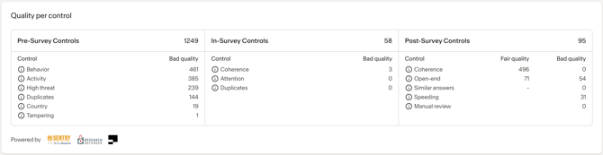
Frequently asked questions
How is the good-to-bad-quality ratio calculated?
The 'Good-to-bad quality ratio' compares respondents who passed our quality controls with those who failed them. The higher the ratio, the greater the 'inherent quality' of the source.
How is the survey attempts metric calculated?
The median number of surveys attempted (not completed) made by respondents in the last 24 hours. A high frequency may indicate that a respondent is a professional survey taker, which can impact the quality of responses.
Our threshold is 30 attempts before we kick that respondent out of the survey.
Why is CATI greyed out in some instances?
When a project uses multiple sources, including CATI partners, the CATI line is greyed out while keeping the statistics visible. This is because CATI respondents follow a fundamentally different methodology compared to digital sources like Social Media or CAWI.
Unlike other sources, CATI respondents are recruited and screened manually, often from client lists or niche B2B panels. This results in:
-
Lower volume, but higher targeting precision
-
No automated pre-survey cleaning, but human vetting up front
-
No data on survey frequency or good-to-bad ratios, but live interviewer oversight and real-time quality control
Because of these differences, CATI respondents naturally show artificially better quality compared to web sourced respondents. To maintain a fair and transparent comparison across all sources, we grey out CATI results but still display their associated metrics.
You can hover over the ℹ️ icon for a quick reminder of why CATI data is presented this way.